nyc dance extension
grid
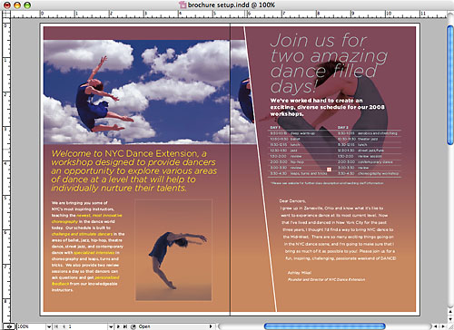
Our girl Ashley from around-the-way and an alumn of OSU needed a brochure for a dance convention she is putting together. I wanted to cut out the letters and use wire and foam to arrange and shoot it.
When i look at it again it feels a little like BAM or Wexner Center or Walker Art Center. It may be the gradients and the use of single typeface with multiple weights



View some dance photos of Ashely here

